A complete rebrand
for Honest, a consultancy startup
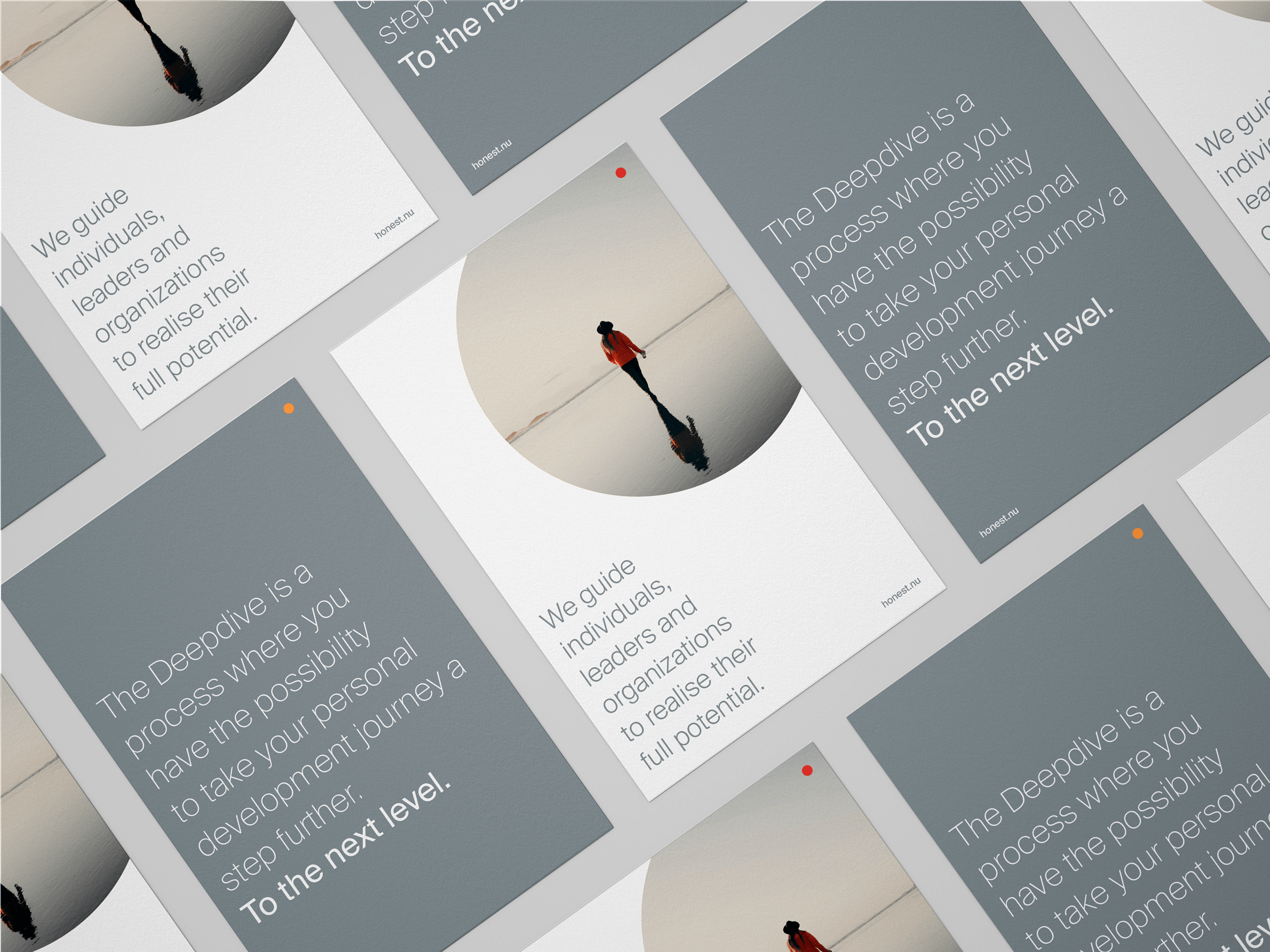
Honest guides individuals, leaders and organisations to realise their full potential. Trough a mix of leadership and personal development programmes, and purpose driven consultancy. Translating elusive concepts and vistas into tangible design. Understated yet supportive and purposeful.
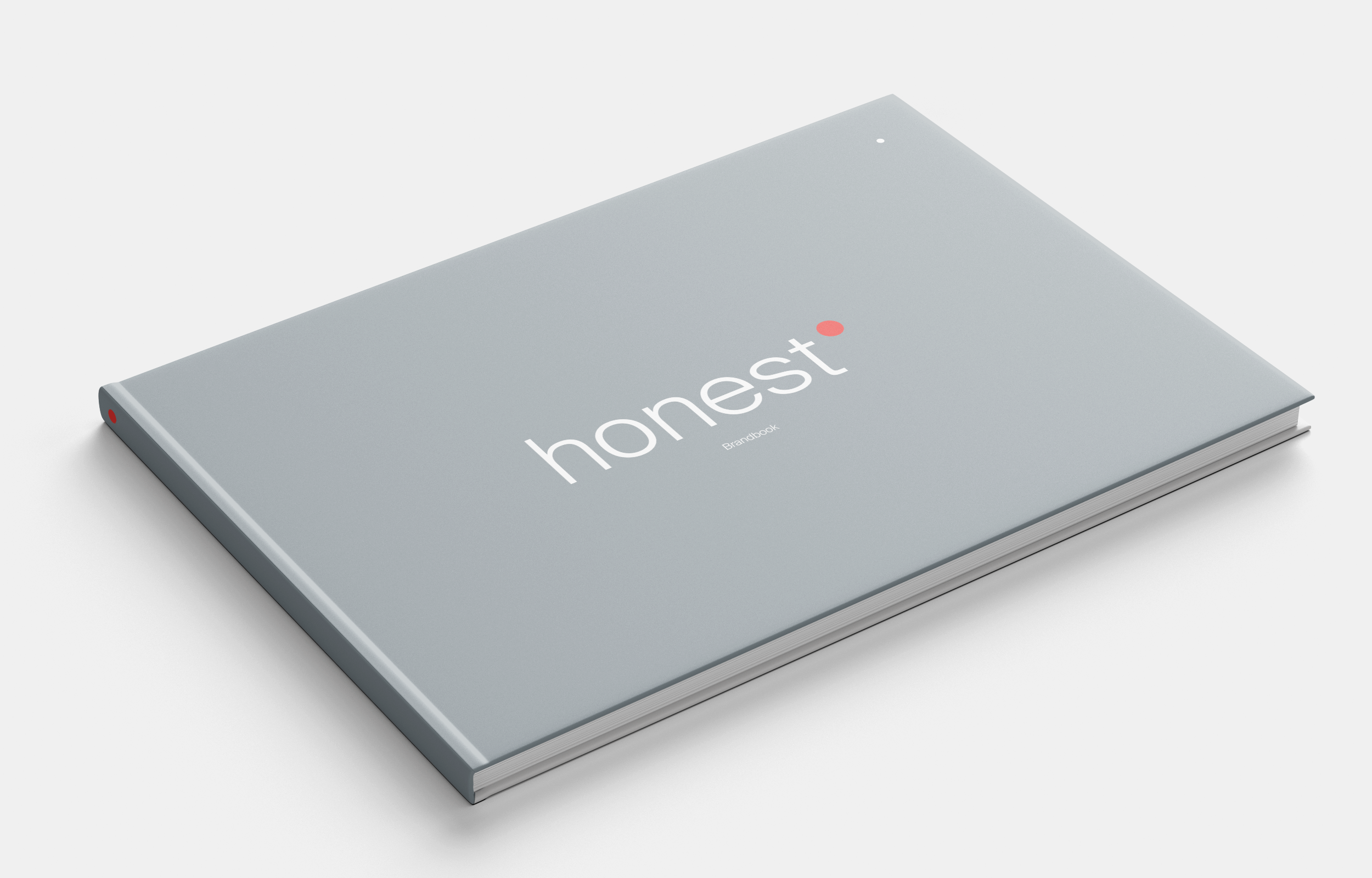
Meaningfull simplicity
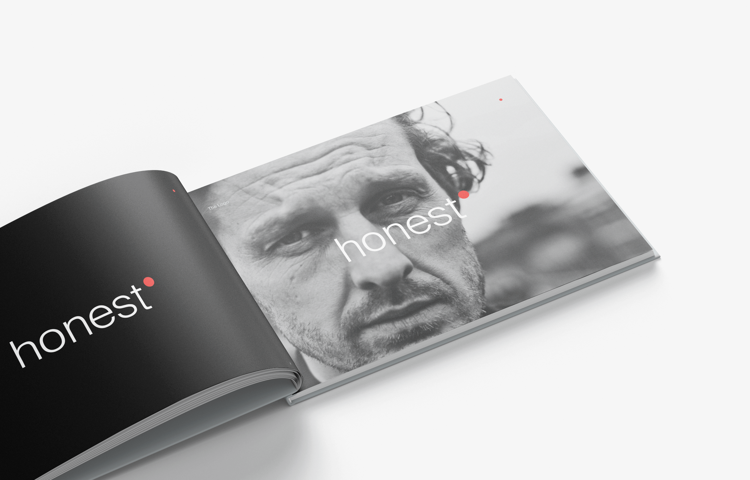
A simple wordmark accompanied by an elevated circle. The circle is a shape that represents a variety of ideas across time and cultures; being complete, wholeness, beginnings, the sun, Mother earth, infinity and ongoing energy, just to name a few. All concepts honest identifies with and constantly strives for as a brand.
Much like the circle, honest may mean different things to different people. The abstraction of the circle is whatever you make it to be.
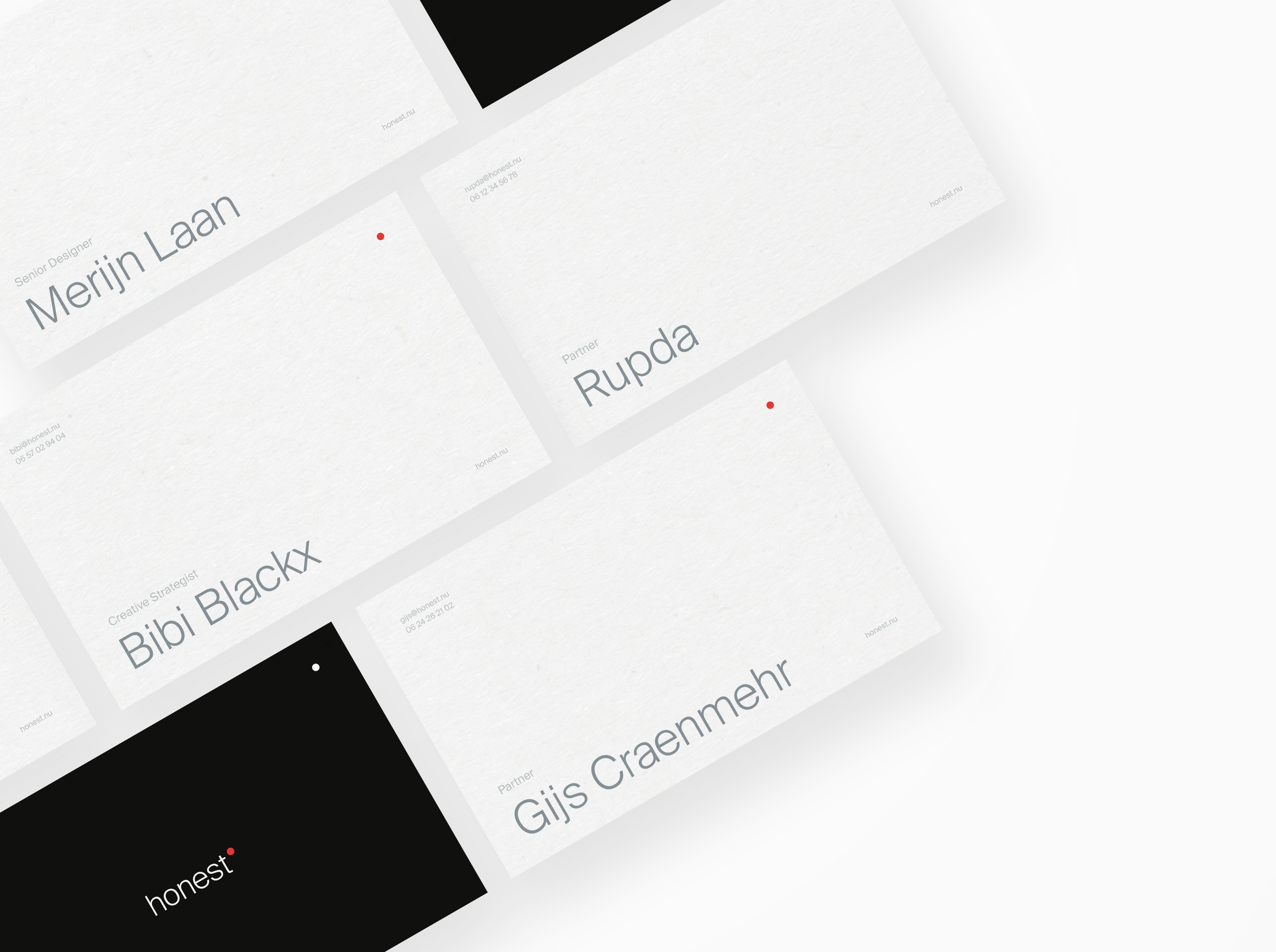
No capital. Honest is not here to make a statement, honest is here in support. We do not pressure ourselves onto a process. Rather we facilitate.
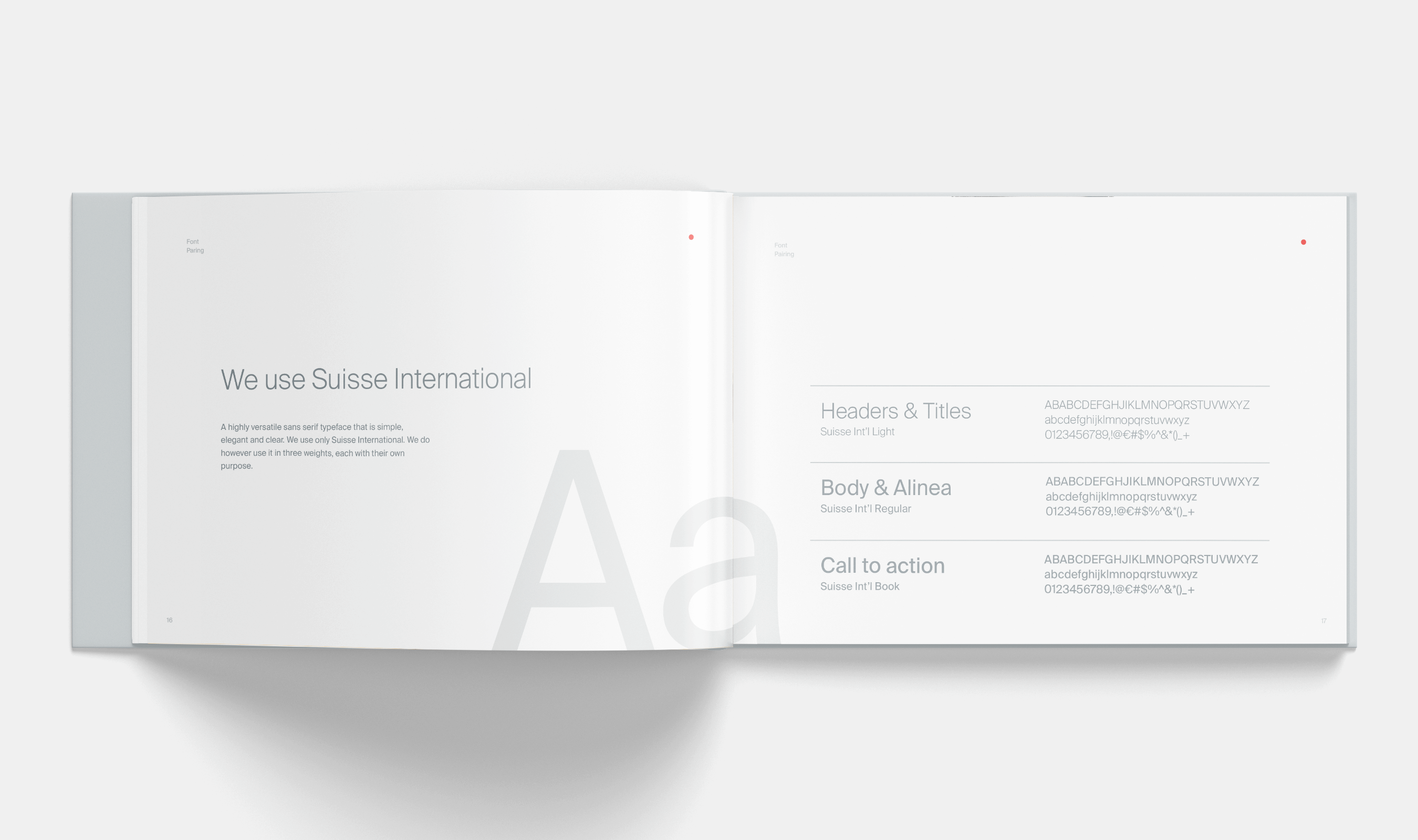
Honest facilitates. So it made sense to keep its design clean and elegant. Trough grey tones, the Suisse International typeface and white space keeps honest’s presentation minimal but distinguished.
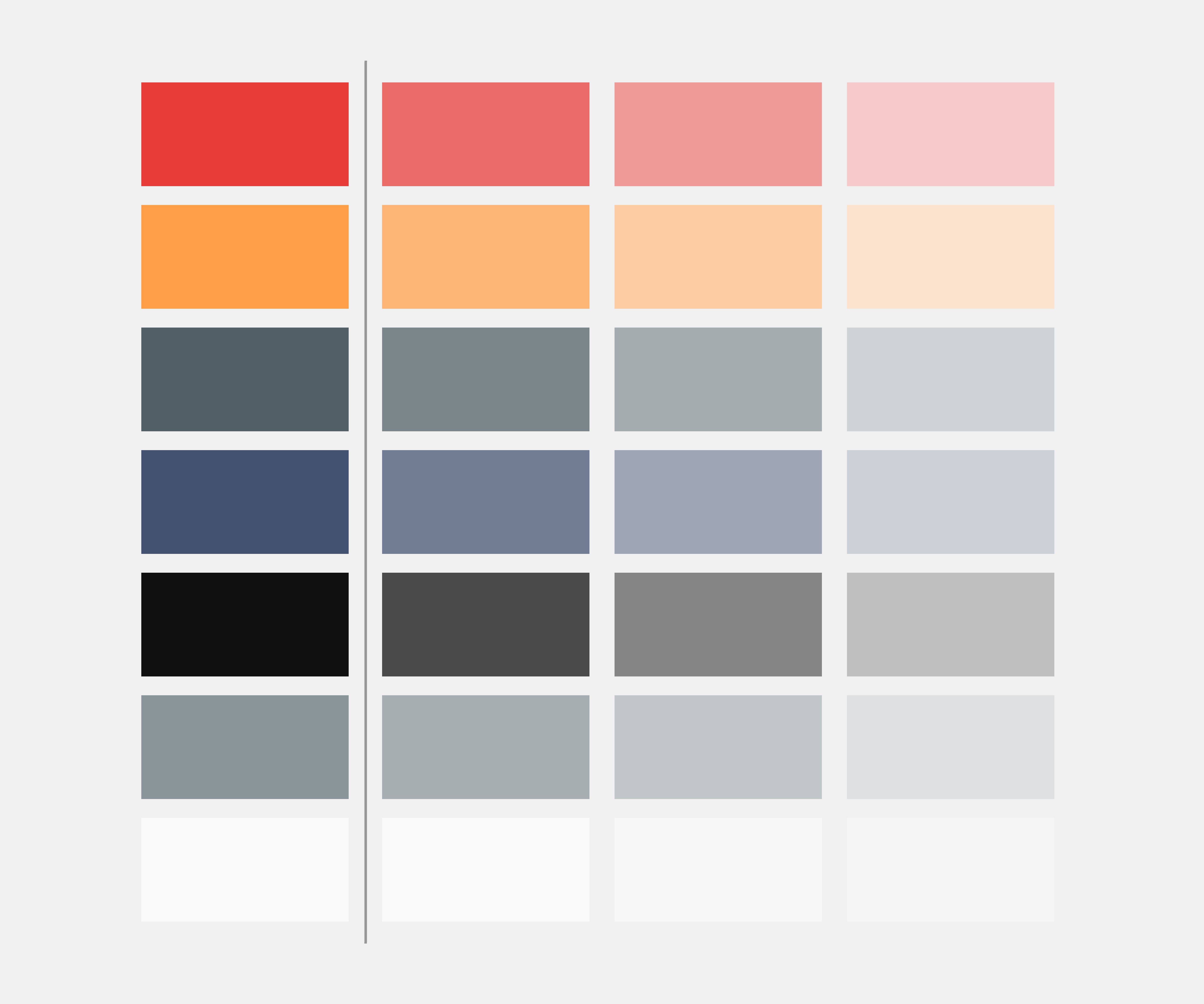
The colours do pop however. It gives the honest brand an edge and recognisability. The colour hiarchy identifies what service of the brand you’re dealing with.
Copyright © 2024 Jacko van Dijke
All rights reserved